Monster artwork critique. no number crunching allowed!
+16
robinsonsteve62
Khastarax
ctigers124
General Osf
J-Tin
kyan
Gespens
ILVS2
larry378
Armitaage
Bestron2
.:::Yoshi:::.
Horg
blah
applesauce
JessicaMD
20 posters
Page 1 of 2
Page 1 of 2 • 1, 2 
 Monster artwork critique. no number crunching allowed!
So! We've got a lot of threads talking about which team/monsters are best and by how many points precisely, so I thought we should also have a thread about which monsters are the best looking!
Which monsters do you find to be the most 'photogenic'? and why?
Which monsters do you begrudgingly use on your team solely because of their stats/skill but otherwise find to be an eyesore? (I'm looking at YOU child of pit!)
I'll start off!
(By the way, for those who don't know; here's a link to the bestiary, with pictures of every single monster!) CLICK ME!

I obviously have to start with the Gold Gorger Dragon, it's a dragon. made out of gold. Love it. I also really like the monster art with people or something to give a sense of scale!

Snowstorm was one of my first monsters, I like how the picture is zoomed out and shows the whole dragon, very pretty turquoise coloring, and graceful design. and I'll never forget the first time I enlarged the picture and saw the horse. (I like refrences that give the monsters scale)

Corporeal Devoid; the first thing I thought when I saw the little monster picture in somebody's formation in-game was "that alien ship from close encounters of the third kind", then the full pic reveals that the freaky alien mothership is actually just the HEAD of this giant badass space gorilla thing, I really like the trippy artwork, in combination with a great name that really fits it; 'corporeal devoid', because what the heck is that thing?!

Quetzalcoatl is a flying green feather boa, and he's grinning from ear to ear. Looks cuddly too
Now, for one I don't like...

Yeah, yeah, ok, it's the backbone of every single sin demon team, and sin is the largest group (player-wise), and demons are the most popular combo for sin, so being anti-pit could be construed as being anti-fossil fuel in a real world analogy, I acknowledge that pit is a crucial monster to the 'entire game'; but I maintain that it looks DUMB. The slack jawed drooling makes pit look more stupid than scary, and the fish-man-centipede genetic splicing causes those silly spikes on the back that look like a fish with a removed fin, and those tiny hands make it more laugh-worthy than cringe-worthy,
What do you think?
Which monsters do you find to be the most 'photogenic'? and why?
Which monsters do you begrudgingly use on your team solely because of their stats/skill but otherwise find to be an eyesore? (I'm looking at YOU child of pit!)
I'll start off!
(By the way, for those who don't know; here's a link to the bestiary, with pictures of every single monster!) CLICK ME!

I obviously have to start with the Gold Gorger Dragon, it's a dragon. made out of gold. Love it. I also really like the monster art with people or something to give a sense of scale!

Snowstorm was one of my first monsters, I like how the picture is zoomed out and shows the whole dragon, very pretty turquoise coloring, and graceful design. and I'll never forget the first time I enlarged the picture and saw the horse. (I like refrences that give the monsters scale)

Corporeal Devoid; the first thing I thought when I saw the little monster picture in somebody's formation in-game was "that alien ship from close encounters of the third kind", then the full pic reveals that the freaky alien mothership is actually just the HEAD of this giant badass space gorilla thing, I really like the trippy artwork, in combination with a great name that really fits it; 'corporeal devoid', because what the heck is that thing?!

Quetzalcoatl is a flying green feather boa, and he's grinning from ear to ear. Looks cuddly too
Now, for one I don't like...

Yeah, yeah, ok, it's the backbone of every single sin demon team, and sin is the largest group (player-wise), and demons are the most popular combo for sin, so being anti-pit could be construed as being anti-fossil fuel in a real world analogy, I acknowledge that pit is a crucial monster to the 'entire game'; but I maintain that it looks DUMB. The slack jawed drooling makes pit look more stupid than scary, and the fish-man-centipede genetic splicing causes those silly spikes on the back that look like a fish with a removed fin, and those tiny hands make it more laugh-worthy than cringe-worthy,
What do you think?

JessicaMD- Posts : 556
Join date : 2012-09-09
 Re: Monster artwork critique. no number crunching allowed!
this:

because, awesome lol

because, awesome lol

applesauce- Posts : 539
Join date : 2012-09-04
Age : 35
Location : US
 Re: Monster artwork critique. no number crunching allowed!
Lol while we're at it, we may as well toss in Selene and some other random girls.
On the gross side, Child of Purification looks almost as gross as its cousin Child of Pit.
On the gross side, Child of Purification looks almost as gross as its cousin Child of Pit.
blah- Posts : 234
Join date : 2012-08-23
 Re: Monster artwork critique. no number crunching allowed!
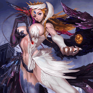
Amazing for four reasons...
1. Boobs
2. Big Boobs
3. Fake Boobs
4. Cartoon Fantasy Boobs

^^ Looks like you could tap it, it would fall on its back and not be able to get up. Disappointing compared to blood flame and dust

Horg- Posts : 389
Join date : 2012-09-14
Age : 37
Location : North Carolina
 Re: Monster artwork critique. no number crunching allowed!
Good idea for a thread!
My favorites are the Snowstorm Dragon and Rhea

Least favorites are casts
(For example rot cast)

Slaughter Bee Queen

Beezlebub

Pit and Child of Purification
Just my opinion
My favorites are the Snowstorm Dragon and Rhea

Least favorites are casts
(For example rot cast)

Slaughter Bee Queen

Beezlebub

Pit and Child of Purification
Just my opinion
.:::Yoshi:::.- Posts : 60
Join date : 2012-08-21
 Re: Monster artwork critique. no number crunching allowed!
blah wrote:Lol while we're at it, we may as well toss in Selene and some other random girls.
On the gross side, Child of Purification looks almost as gross as its cousin Child of Pit.
believe or not im actually not that much into selene, sure big boobs and all but eifu is more...tasteful in my opinion. also for the record, the "childs" artworks suck :/

applesauce- Posts : 539
Join date : 2012-09-04
Age : 35
Location : US
 Re: Monster artwork critique. no number crunching allowed!
applesauce wrote:blah wrote:Lol while we're at it, we may as well toss in Selene and some other random girls.
On the gross side, Child of Purification looks almost as gross as its cousin Child of Pit.
believe or not im actually not that much into selene, sure big boobs and all but eifu is more...tasteful in my opinion. also for the record, the "childs" artworks suck :/
Strangely enough I agree with you. Not to mention maybe I'm picking waaaaay too far, but I think that Selene is just too muscular for my tastes, and also her thighs just seem... well, not in proportion.
Unforgiven Eifu is okay, but I prefer Enchanting Alraune, the unevolved version of Glamourous Alraune. Dunno, it just seems to look better than its evolved version, but maybe that's just my tastes.

Bestron2- Posts : 217
Join date : 2012-09-02
Location : Sydney, Australia
 Re: Monster artwork critique. no number crunching allowed!


nuff said
I'd put more that I like visually, but I am on my phone

Armitaage- Posts : 1264
Join date : 2012-08-26
Age : 39
 Re: Monster artwork critique. no number crunching allowed!
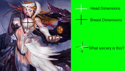
There's a point at which larger breasts are no longer a good thing, and although I can't articulately define where the point is, this has clearly passed it. spherical boobies bigger than someone's head are just wacky looking. Selene's artwork gives the slight suspicion that the artist may have only heard about, but never has actually seen a woman before.
Eifu (all permutations) is classy as hell. I'd like to see more like that
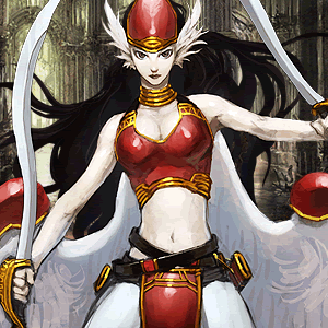
WWE is clearly wearing a cheerleading uniform, and that's great.
I'd say WWE is an interesting monster to compare to child of pit. because both are terribly 'weak' monsters stat-wise (compared to legitimate agility powerhouses like DCC, Lind, Marbas) but are both widely used due to type/skill popularity in formations. WWE is actually slightly weaker than pit if you go stat for stat, but WWE is about 1e100X better looking.

Two words; fur bikini.
Two more words; hell yeah

larry378- Posts : 927
Join date : 2012-08-17
Location : Riding a missile waving a cowboy hat
 Re: Monster artwork critique. no number crunching allowed!
larry378 wrote:
There's a point at which larger breasts are no longer a good thing, and although I can't articulately define where the point is, this has clearly passed it. spherical boobies bigger than someone's head are just wacky looking. Selene's artwork gives the slight suspicion that the artist may have only heard about, but never has actually seen a woman before.
More like seeing as how most of the artwork is drawn by a japanese anime artist, they love boobs. Big or small they get drawn. They have animes with them being the size of half there body lol. They love 'em.
ILVS2- Posts : 26
Join date : 2012-09-29
 Re: Monster artwork critique. no number crunching allowed!
larry378 wrote:
There's a point at which larger breasts are no longer a good thing, and although I can't articulately define where the point is, this has clearly passed it. spherical boobies bigger than someone's head are just wacky looking. Selene's artwork gives the slight suspicion that the artist may have only heard about, but never has actually seen a woman before.
They aren't as big as they seem due to perpspective... though still pretty big.
I still like the art.
Gespens- Posts : 12
Join date : 2012-10-09
 Re: Monster artwork critique. no number crunching allowed!
Not only that but Selene's thighs are so chunky they defy belief. I mean, since when the hell did thighs become thicker than hips? It defies human physiology, seriously.

Bestron2- Posts : 217
Join date : 2012-09-02
Location : Sydney, Australia
 Re: Monster artwork critique. no number crunching allowed!
Bestron2 wrote:Not only that but Selene's thighs are so chunky they defy belief. I mean, since when the hell did thighs become thicker than hips? It defies human physiology, seriously.
Obviously she's not human. That's the whole point lol.
Even though I have Selene in party. I agree that Aluruane is sexier. Too bad Ateam screw rancor and won't release a mystic agility.
I find the artwork of the recent wyrms to be subpar. Jupiter doesn't even look like a dragon but some giant bug. Of the wyrm, I really like ring. Classic chinese dragon.
Kyan
Kyan's Store
kyan- Posts : 949
Join date : 2012-04-29
 Re: Monster artwork critique. no number crunching allowed!
Bestron2 wrote:Not only that but Selene's thighs are so chunky they defy belief. I mean, since when the hell did thighs become thicker than hips? It defies human physiology, seriously.
Nothing compared to Chun-li in SF4 LOL!
ILVS2- Posts : 26
Join date : 2012-09-29
 Re: Monster artwork critique. no number crunching allowed!
kyan wrote:Bestron2 wrote:Not only that but Selene's thighs are so chunky they defy belief. I mean, since when the hell did thighs become thicker than hips? It defies human physiology, seriously.
Obviously she's not human. That's the whole point lol.
Even though I have Selene in party. I agree that Aluruane is sexier. Too bad Ateam screw rancor and won't release a mystic agility.
I find the artwork of the recent wyrms to be subpar. Jupiter doesn't even look like a dragon but some giant bug. Of the wyrm, I really like ring. Classic chinese dragon.
Kyan
Kyan's Store
I've gotta agree with you about the wyrms! I was really looking forward to being able to do a winged psycho wyrms team after this event, but nope. All the psycho dragons suck, and look terrible.
I also like how the last five or so posts ended up being a play-by-play about selene's breasts and thighs... Thanks Larry

JessicaMD- Posts : 556
Join date : 2012-09-09
 Re: Monster artwork critique. no number crunching allowed!
I disagree, I think they did a great job with the new wyrms, they are supposed to look Alien and they definitely do!
Some Awesome Artwork

This is what would happen if Storm Ship Troopers chose Dragons instead of bugs!

Not a Fan of this one
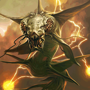
Love it, another starship troopers dragon

Meh

So cool, love the phoenixy kind of look it has

Some Awesome Artwork

This is what would happen if Storm Ship Troopers chose Dragons instead of bugs!

Not a Fan of this one

Love it, another starship troopers dragon

Meh

So cool, love the phoenixy kind of look it has


Horg- Posts : 389
Join date : 2012-09-14
Age : 37
Location : North Carolina
 Re: Monster artwork critique. no number crunching allowed!
Well lets start off with everyone's favorite (who in my mind doesn't look like a Demon, more like an angel) - Hatred Pledge Victoria

Next are the two best B/B+ rank female artwork:
Alluring Black Wings

and Jealous Black Wings

Also what guy does not appreciate Dawn Lilith and the wonderful Harem of women around her

And now my too favorite wyrms:
Magic Light Dragon

and Plague Dragon

And two honorable mention tough guys
Gusion

and Brave Pharaoh


Next are the two best B/B+ rank female artwork:
Alluring Black Wings

and Jealous Black Wings

Also what guy does not appreciate Dawn Lilith and the wonderful Harem of women around her

And now my too favorite wyrms:
Magic Light Dragon

and Plague Dragon

And two honorable mention tough guys
Gusion

and Brave Pharaoh

J-Tin- Posts : 110
Join date : 2012-08-29
 Re: Monster artwork critique. no number crunching allowed!
I like Snowstorm Dragon. The coloring is epic, looks like one of those fantasy paintings instead of some generic drawing (AKA rots).
I also like Flame Kag and Moon Sea Dragon.
I also like Flame Kag and Moon Sea Dragon.

General Osf- Posts : 1046
Join date : 2012-07-14
Location : CA, USA
 Re: Monster artwork critique. no number crunching allowed!
J-Tin wrote:Well lets start off with...
... best B/B+ rank female artwork:
That actually brings up a great point, there are some non A/A monsters which look great

I like this one, first time I got one I tried to hold onto it, until I accidentally sacrificed it to my furnace dragon
(I know about the devil and charm succubus too, but I like Qualm best [natural hair color])

Also a big fan of the nwd (netherworld DRAGONFLY), looks very crystalline and alien, yet completely sleek and stylish.
Special Mention:
VRITRA
the B version looks SO much better than the A version
A version:

B version:

Come on, the A version looks like he just woke up, and he's grumpy, and the B version is flying around wrecking shit with his mouth laser.
But overall, I think Vritra is one of the BEST dragon designs I've seen around, with the exception of Moon Sea, since he's destroying an asteroid field in space or something lol

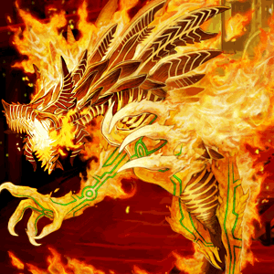
and furnace, because come on, furnace is a dragon made out of FIRE. (incidentally, the first A monster I ever got since I received him from some 'welcome to the game' free summon as I started playing during drops of darkness)

larry378- Posts : 927
Join date : 2012-08-17
Location : Riding a missile waving a cowboy hat
 Re: Monster artwork critique. no number crunching allowed!
A few comments:
The Tier 1 dragons from the wall didn't look so good. Especially Jupiter. It looks like it's in pain, since its eyes look gross. Maybe A-Team incentive for you to do more dragon wall?
I find the magic light Dragon's proportion off. Its neck is far too long for its medium sized body. It's also not really magical-looking, it looks more like a cheap robot that gets beat up by heroes...
Furnace looks cool but is also a little off. To me, it looks like a hound a little more than a dragon(its claws and its posture don't really look dragon-ish to me).
Just my personal feedback on the monsters you guys have put up, since I don't tend to look at the full monster art a lot(my phone tends to lag when that happens).
@larry I can donate you the next qualm succubus I get.
blah- Posts : 234
Join date : 2012-08-23
 Re: Monster artwork critique. no number crunching allowed!
haha lol no worries, I've been banking my succubuses(succubi)? for some time
speaking of "in-pain"

I just wanna cover this fella in bandages
speaking of "in-pain"

I just wanna cover this fella in bandages

larry378- Posts : 927
Join date : 2012-08-17
Location : Riding a missile waving a cowboy hat
.:::Yoshi:::.- Posts : 60
Join date : 2012-08-21
 Re: Monster artwork critique. no number crunching allowed!
i dunno dawn lilan's tits are kinda easty westies

ctigers124- Posts : 140
Join date : 2012-08-09
 Re: Monster artwork critique. no number crunching allowed!
ctigers124 wrote:i dunno dawn lilan's tits are kinda easty westies
Lol dude

General Osf- Posts : 1046
Join date : 2012-07-14
Location : CA, USA
 Re: Monster artwork critique. no number crunching allowed!
Besides Magic Light Dragon or Dragons in general (specifically Quetzalcoatl that really awestruck me the first and only time I got him), my picks are:
Paimon: he is a winged Demonic King wearing golden armor and riding a camel (of all bizarre mounts) to battle while commanding his own army puts him very high on my list when it comes to art work and lore aestethic value.
Hellfield Fiend Asura: The front face staring at you intently with its other heads conveying different states of his mind(s) at the same time and his many arms poised to strike at a moment's notice fits into the bloodthirsty monster imagery.
Jiangshi Fighter: A chinese "Zombie/vampire/some undead" that knows kungfu, how awesome is that!?
Starmaiden Rhea: She got an elegant bearing and her eyes seems to be glancing longingly into the distance while she still bears a serious look.
In the end I find most artwork in this game very impressive whereas most other Japanese games are too typical manga/anime cartoonish (as much as I am a fan of the genre myself DS's theme in general is a refreshing breeze among the mobile games of this genre).

Khastarax- Posts : 164
Join date : 2012-08-16
Page 1 of 2 • 1, 2 
 Similar topics
» Most Gruesome Monster Artwork?
» DS artwork
» sin progression unruly cell
» How to find someone through user number
» Monsters Lair [List of ALL monsters!]
» DS artwork
» sin progression unruly cell
» How to find someone through user number
» Monsters Lair [List of ALL monsters!]
Page 1 of 2
Permissions in this forum:
You cannot reply to topics in this forum


 Home
Home


